

Elster House - Before and After
At first glance, this kitchen reads as calm, resolved and simple. But it’s a good example of how the most refined spaces are often the most considered.
Nothing here is accidental.
The original space was a very different story: a U-shaped kitchen with a raised 90s-style ledge cutting off the connection to the dining area, a small, awkward island that didn’t really serve a purpose, and a mix of aqua green benches, timber and terracotta-look floor tiles. It felt enclosed, segmented and visually busy.
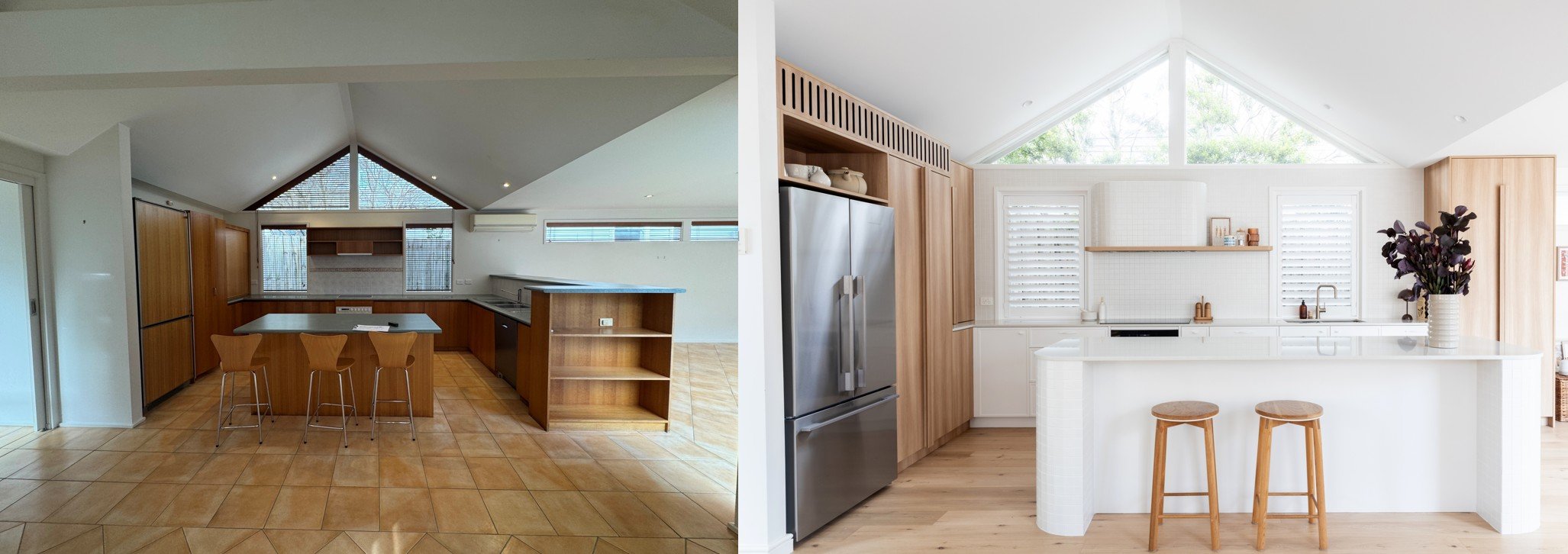
Before and After - from heavy and closed off, to open, bright and inviting.
The Brief
The brief was to simplify, open it up, and create something that felt quietly cohesive.
The entire layout began with one non-negotiable: the kitchen tap needed to sit perfectly centred to the window. That single decision set the framework for everything that followed - bin and dishwasher positioned either side, locking in the functional core of the plan early.
From there, the cooktop became the next key move. Rather than centring it between the two windows (the obvious choice), I intentionally offset both the cooktop and rangehood. It gave us flexibility where we needed it - particularly with tiling - and allowed for a properly scaled shelf for display. Had we centred it, we would have ended up with narrow, slightly awkward shelving either side. Technically “correct”, but visually unresolved, with cooking and wash zones overlapping.
This is often the tension in a project like this - symmetry versus usability. Usability won.
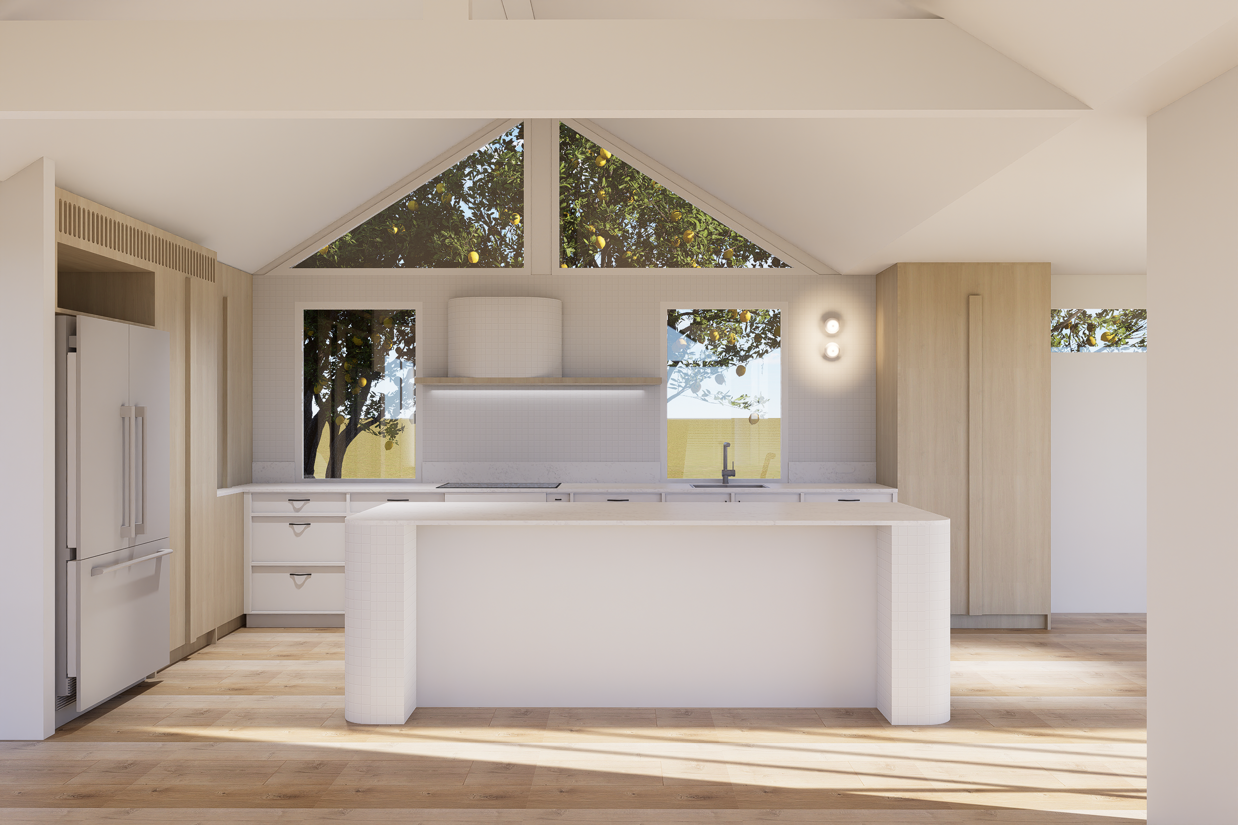
Our renders gave the client confidence and clarity as to the end result.
The Response
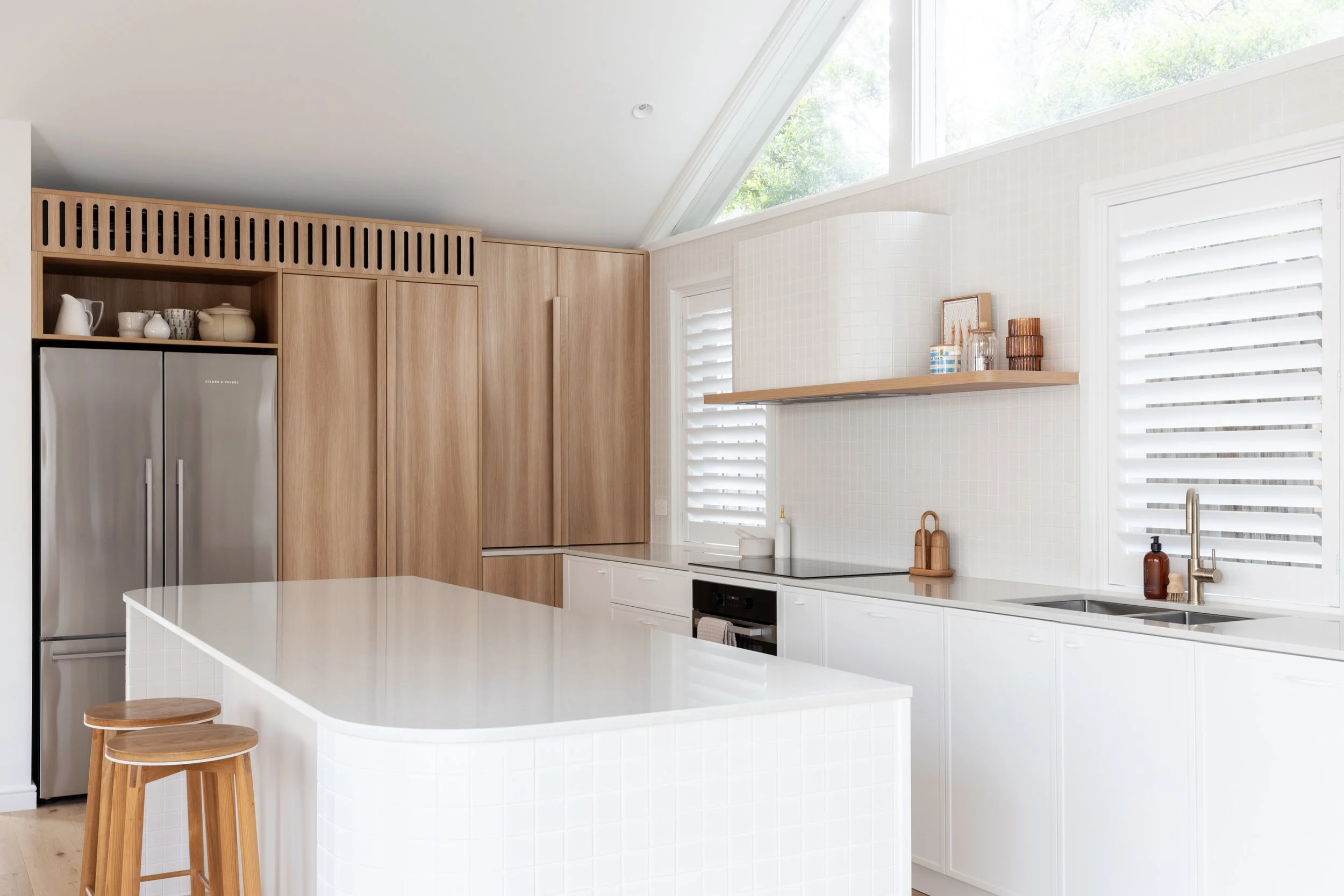
Another layer of complexity was that the design was completed without a site measure, as the clients hadn’t yet settled on the home. Everything was based on original plans, so setting a clear datum line became critical. We aligned this with the top of the windows, which then informed the finished heights of the pantry, fridge cabinetry, and the bar joinery to the right - allowing everything to sit cleanly and intentionally beneath the ceiling line.
Consistency carries a lot of the visual weight in a space like this. Even the tall cabinet handles were custom detailed, timber veneer, set at a precise height across all joinery to create a subtle but important rhythm.
Midway through the build, we had a curveball. The original split system needed to be relocated, and the only viable position for the new HVAC unit was above the fridge. This required a full rethink of that section of cabinetry, along with accommodating ducting and ventilation requirements.
Rather than treating it as something to hide, we leaned into it. The grille was resolved as a routed timber detail, aligned with the material palette and proportioned to feel intentional. It does the job technically, but also reads as a feature rather than an afterthought.
Detailed planning ensured onsite challenges were easily addressed.
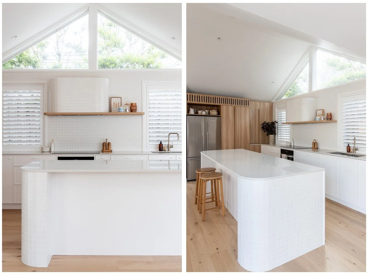
The tiled elements were equally considered. The radius of the island and the curved rangehood meant tile selection, sizing and set-out were tested carefully to ensure they wrapped cleanly without awkward cuts or distortion.
And finally, the finish. All cabinetry was done in 2pac to match the walls, removing contrast and allowing the form and materiality to do the work rather than colour.
What looks simple is usually the result of constraint, iteration, and a lot of small decisions made well.
You can see more of our Elster House project here.
If you're planning your own renovation in Melbourne and want clarity on what your specific project might involve, a tailored scope conversation is always the best first step. Start the conversation here.
Joinery by Ilm Interiors, Photography by Lisa Atkinson.